
How to Read Candlestick Charts
Every candle tells a four-number story: open, high, low, close. Learn to read candlesticks fluently, choose the right timeframe, and set up a clean chart that shows you the market instead of hiding it.
📘 The market's handwriting
Price charts are the market's handwriting — a continuous record of every agreement between buyers and sellers. Learn to read the handwriting and you can open any chart, on any pair, on any timeframe, and know within seconds what kind of day the market is having.
Three chart styles dominate:
Line charts connect closing prices — clean, great for big-picture shape, blind to everything that happened between closes.
Bar charts show open, high, low and close as ticks on a vertical bar — informative but visually stingy.
Candlestick charts show the same four numbers, drawn so vividly that traders have used them since 18th-century Japanese rice markets. This is what nearly everyone uses, and what we will use for the rest of the course.
🎯 What you will learn
The anatomy of a candle: body, wicks, and the four prices inside.
How to read the story in bodies and wicks.
What timeframes really are, and which ones beginners should live on.
How to set up a chart that informs instead of overwhelms.
🕯️ Anatomy of a candle
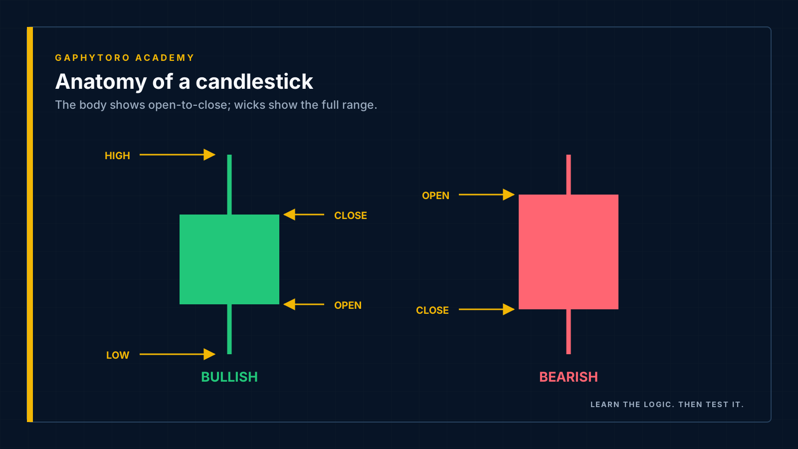
Each candle summarises one time period — one minute, one hour, one day — with exactly four numbers:
Open — the first traded price of the period.
High — the highest price reached.
Low — the lowest price reached.
Close — the final traded price of the period.
The thick part — the body — spans open to close. The thin lines above and below — the wicks (or shadows) — mark the extremes that price visited but could not hold.
Close above open → a bullish candle (typically green): buyers won the period.
Close below open → a bearish candle (typically red): sellers won it.
📖 Reading the story
The magic is not in the four numbers — it is in their proportions. A few sentences from the market's phrasebook:
| What you see | What happened | The story |
|---|---|---|
| Long body, tiny wicks | Price marched from open to close | Conviction — one side controlled the whole period |
| Tiny body, long wicks both sides | Big travel, no net progress | Indecision — a tug-of-war ending in a draw |
| Long lower wick, close near high | Sellers pushed price down; buyers threw it back | Rejection of lower prices — demand lives down there |
| Long upper wick, close near low | Buyers reached up; sellers slapped it down | Rejection of higher prices — supply waits above |
Wicks are failed journeys. A long wick says: "price went there, and the market refused to let it stay." Where the market refuses matters enormously — remember that when we reach support and resistance.
One warning while your enthusiasm is fresh: single candles are hints, not commands. A rejection wick at a level that matters is information; the same wick in the middle of nowhere is noise. Context is everything, and context is exactly what the next lesson provides.
⏱️ Timeframes: the zoom dial
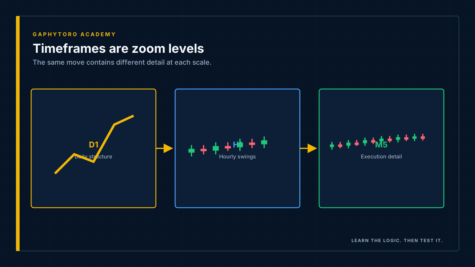
A timeframe sets how much time each candle summarises. The same market, three zoom levels:
Daily (D1): each candle is one day. Weeks of structure visible at a glance — the strategic view.
One-hour (H1): each candle is one hour. The day's battle unfolding — the tactical view.
Five-minute (M5): each candle is five minutes. Every skirmish visible — and every bit of noise too.
Important: timeframes do not disagree, they summarise differently. A single daily candle contains twenty-four H1 candles; nothing about them conflicts. Confusion only arises when a trader plans on one zoom level and panics on another.
Beginner recommendation: live on H1 and above (H1, H4, Daily). Slower candles give you time to think, punish impulse less, and carry proportionally less spread cost per trade. The M1 and M5 charts are where beginners go to donate money quickly.
🧹 The clean chart rule
Open a beginner's chart six months in and you often find it buried under five indicators, three oscillators and a rainbow of trend lines — a cockpit with so many dials nobody is flying the plane.
Start the opposite way. Your chart needs exactly:
Candlesticks.
Nothing else (for now).
We will add tools deliberately in the next lesson, one at a time, each with a job description. A tool you cannot explain in one sentence does not belong on your chart. Price itself is the primary indicator — everything else is commentary.
Habit to start today: at the end of each practice session, screenshot your chart and write two sentences about what you saw. Chart-reading is a language — daily reading builds fluency, and attaching screenshots to your trade reviews builds a library your future self will study. (When you connect a live account later, GaphyToro captures trade screenshots automatically — but the two written sentences will always be yours.)
✅ Key takeaways
Every candle encodes open, high, low, close for its period — body plus wicks.
Proportions tell the story: long bodies = conviction; long wicks = rejection; balance = indecision.
Single candles are hints; location gives them meaning.
Timeframes are zoom levels of one reality — beginners belong on H1 and above.
Start with a naked chart; earn every tool you add.
⏭️ Coming up next
You can read individual sentences. Now for grammar: trends, ranges, support and resistance — the structure that turns candle-reading into market-reading, plus your first three indicators.